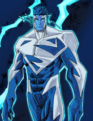
After finishing the maxx vs the thing I knew that the next piece I had to color was this one. I feel that the BG came out a little to realistic for the rest of the picture but overall Im pretty proud of how it turned out
This is the second pic I've done in PS, so I would like to get some critiques so I can learn from my mistakes
Overall, this is a fine coloring job. If I may, I would like to point out some things that may help bring your drawing out a bit more.
The first thing I noticed was that you highlighted the muscles from opposite sides. In most cases, you have to be aware that there would be a strong single light source to light one side of any object. That doesn't mean that there can't be more than one light source, but you should have one main light source, and the rest of the light sources would be secondary. Meaning, that they wouldn't be as strong in intensity. So I would figure out if your light was coming from the back, front, right, left, top, or bottom, then highlight accordingly. That means that some of the figure could be in complete shadow, but, in the case of Spawn, that would give him more of a mysterious look. The same goes for shadowing, just in the reverse. If you are lighting from the right, you have shadows on the left.
If you did the line art, then you may want to watch the symmetrical accidents. In this case, the cape. It looks the same on the left, as it does on the right. Try not to use equal symmetry when drawing something as natural as this. The perfect example are the chains... They are great in the way that there aren't the same flowing lines on both sides, and that they just seem to randomly run a muck. I like the chains.
The background is good, I would suggest using the light rendering filter, to give a slight hot spot to the back ground. Let the edges slip into darkness, and give more depth to the image.
With regards to the smoke, or fog, try not coloring so solid. As a trick to create smoke or fog, select the area that you just made in white, go to the clouds filter, and create a whole new look. Once you've done that, you can tweak the results to do more than just a white singular sheet of color.
You are doing great with the total look, but I just wanted to point these things out, because with Photoshop, there are many tools at your disposal, and you should make use of them. See what you can do by playing around with the tools I suggested.
Don't be discouraged...You are doing a fine job!!
Terry
--
If love is the key....I am the door. I only ask that you don't abuse the key.
Depending on the version of Photoshop you are using, it should be easy to find...Just scroll across the menu bar at the top of the window, until you see "Filter" roll your mouse over that option, and a roll down menu will pop up, showing you many options. That is where you should find things like art brushes, paint styles, and the lighting effects. Lighting effects and clouds, are under the sub menu entitled "render".
Try these options out. Don't be afraid to see what each item will do for a specific function. There are also plugins that you can either buy or download, that can enhance your work. I actually have an old filter added to my Photoshop called Eye Candy, or Alien Skin. It's kinda nice because it does several different special effects.
Glad to be able to help. Any questions are greatly welcome, just PM me.
--
If love is the key....I am the door. I only ask that you don't abuse the key.
DeviantART and Wacom are proud to present the second Intuos4 "Bring Your Vision To Life" contest! Open to all artists all over the world, we challenge you to show us your dreams and aspirations for the future. Get drawing!
DeviantART and the martial arts action film, Ninja Assassin, have teamed up to allow ALL deviants the ability to install Journal Skins! Select an awesome Ninja Assassin skin or choose the skin of your choice.
Daily Literature Deviations is a group that is dedicated to bringing literature to the forefront of the deviantArt community. We attempt to accomplish this by daily featuring Literature artists from around the community that deserve the recognition, but are not getting it.
Each day we will feature 5 deviations from the Literature categories in a News Article. In order to support the artists that we feature, we ask that you the news article as well as check out the individual pieces. We understand that each day you may not be able to check out each and every one of the pieces, everyone has their own things going on. We just ask that you make an attempt to help support the growing Literature community.
The Deviousness Award is an accolade which is traditionally handed out on the 1st of every month to one trully outstanding deviant. `Cyantre is one of the most helpful deviants within our community. With a positive attitude and a resourceful mind, you can always find him providing support and encouragement to those in need. Always looking for ways in which he can get more involved in our community, John's positive presence is to be aspired to. A well respected poet, John is a must-have on your deviantWATCH to make sure that you don't miss out on your dose of community inspiration. It's with great pleasure that the Deviousness Award for November 2009 goes to... Read More
Comments
The first thing I noticed was that you highlighted the muscles from opposite sides. In most cases, you have to be aware that there would be a strong single light source to light one side of any object. That doesn't mean that there can't be more than one light source, but you should have one main light source, and the rest of the light sources would be secondary. Meaning, that they wouldn't be as strong in intensity. So I would figure out if your light was coming from the back, front, right, left, top, or bottom, then highlight accordingly. That means that some of the figure could be in complete shadow, but, in the case of Spawn, that would give him more of a mysterious look. The same goes for shadowing, just in the reverse. If you are lighting from the right, you have shadows on the left.
If you did the line art, then you may want to watch the symmetrical accidents. In this case, the cape. It looks the same on the left, as it does on the right. Try not to use equal symmetry when drawing something as natural as this. The perfect example are the chains... They are great in the way that there aren't the same flowing lines on both sides, and that they just seem to randomly run a muck. I like the chains.
The background is good, I would suggest using the light rendering filter, to give a slight hot spot to the back ground. Let the edges slip into darkness, and give more depth to the image.
With regards to the smoke, or fog, try not coloring so solid. As a trick to create smoke or fog, select the area that you just made in white, go to the clouds filter, and create a whole new look. Once you've done that, you can tweak the results to do more than just a white singular sheet of color.
You are doing great with the total look, but I just wanted to point these things out, because with Photoshop, there are many tools at your disposal, and you should make use of them. See what you can do by playing around with the tools I suggested.
Don't be discouraged...You are doing a fine job!!
Terry
--
If love is the key....I am the door. I only ask that you don't abuse the key.
Try these options out. Don't be afraid to see what each item will do for a specific function. There are also plugins that you can either buy or download, that can enhance your work. I actually have an old filter added to my Photoshop called Eye Candy, or Alien Skin. It's kinda nice because it does several different special effects.
Glad to be able to help. Any questions are greatly welcome, just PM me.
--
If love is the key....I am the door. I only ask that you don't abuse the key.
--
If love is the key....I am the door. I only ask that you don't abuse the key.
--
Take a RHARDOZE of me...
accepts commissions starting at $6
Previous Page12Next Page